Google recently released the first preview of Android 12 for developers. Enthusiasts began to understand what awaits us with the release of the new OS, and discovered a number of hidden surprises.
As it turned out, Google is still hiding significant differences in the Android 12 interface. About
However, members of the mobile application development community XDA Developers were able to activate the initially locked design elements of the Android 12 Developer Preview and take screenshots.
The appearance of the lock screen, notification bar and always-on display will change dramatically.
On the always-on display, the main information has moved from the center to the upper part of the screen, the clock has acquired a more modern look, and the date and weather widget has become smaller and shifted to the right.
Message icons will be below the widget.
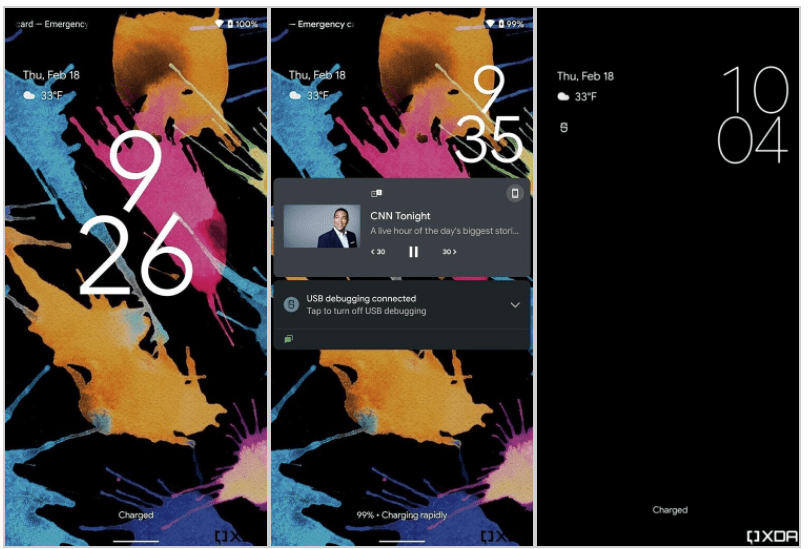
When switching to the lock screen, the clock widget increases, the font becomes thicker, occupying a large part of the screen.
When warnings appear, the clock widget returns to the "always on" display size.
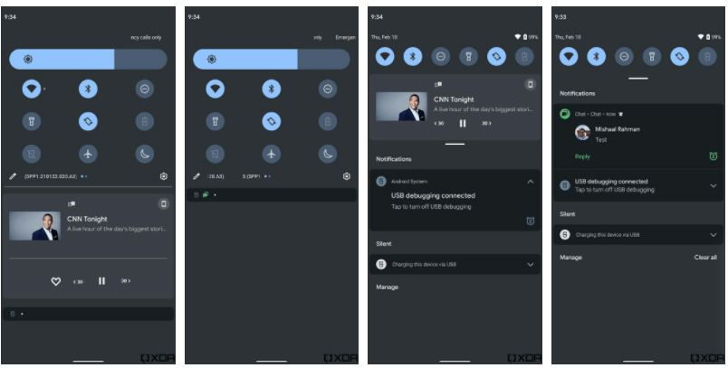
The message bar has changed a lot. The quick settings icons are arranged in a 3 x 3 grid.
The background is not as transparent as in the standard design version of Android 12 DP1. Brightness controls take up more space, message cards also look a little different.
Please note that you should not attempt to activate similar changes on your device.
Мабуть, Google не дарма їх сховав. Крім того, поки вони не стануть загальнодоступними в бета-версії, не можна сказати, чи з’являться такі зміни в стабільній версії Android 12 для звичайних користувачів.